Welcome to the #vacasaparty!
It's official... we are VACASA! All things Sugar & Gold have been swapped out so make sure to look for our new name on the blog, Pinterest, and our new website address!
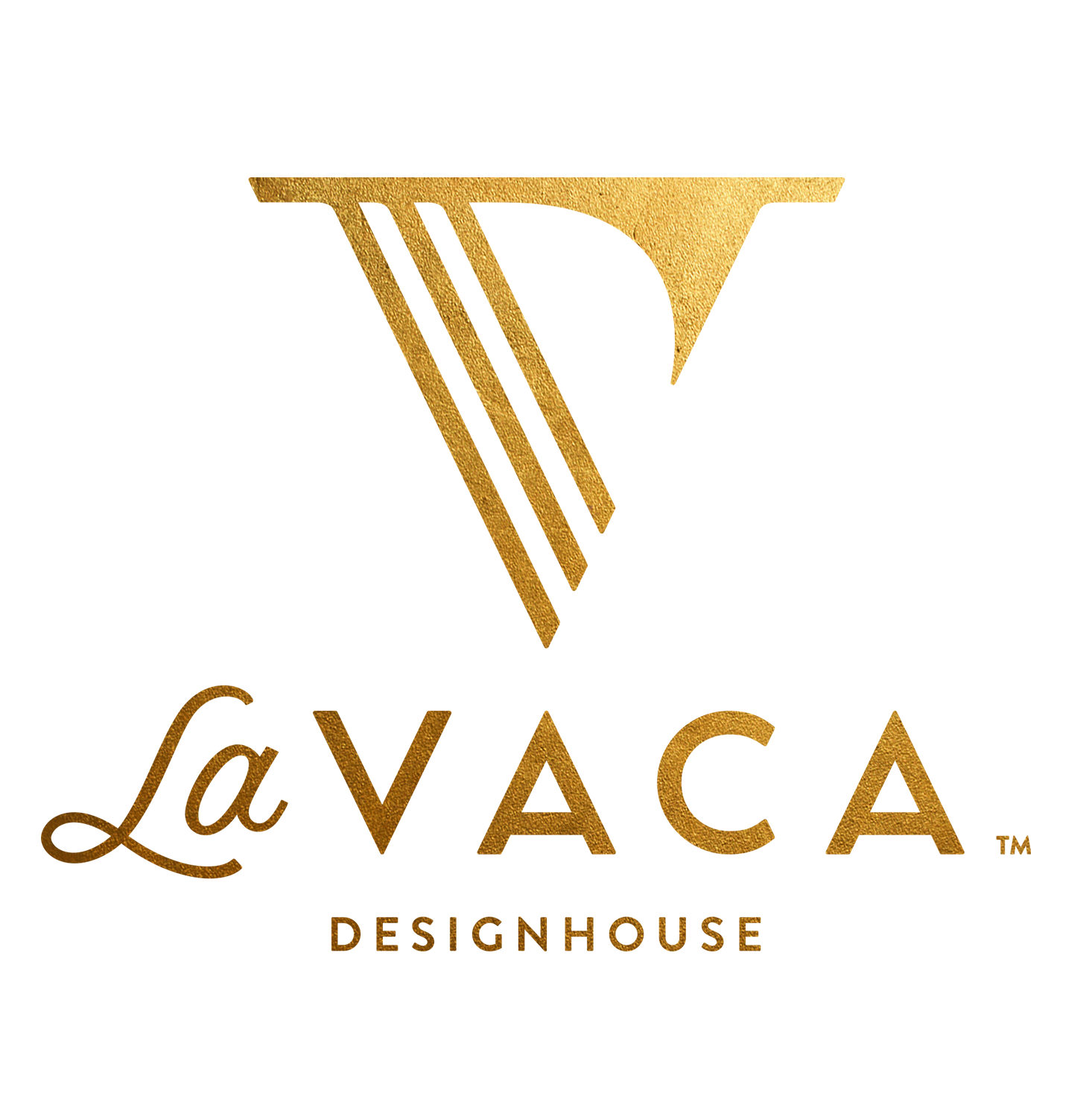
More to come about our new branding, but one of my favorite things about our new look and feel is the V icon. When rebranding, I wanted to create one element that was ownable and could stand alone to represent our brand without the wordmoark... and a V monogram made the most sense, being not only the first letter of our company name but also our last name (which is obviously the reason behind our new company name). I wanted to do something unique and clever when developing the V icon that felt custom to us.
So if you look closely, you can see an "E" and "D" hidden in the icon to represent myself, Emily, and my husband, David. The "E" is created out of the three diagonal bars on the left side, and the "D" is created in the negative space between those diagonal bars and the curved solid element on the right side. Another hidden element is the crossbar at the top of the icon... our last name Vaca means "cow" in Spanish (yes, little golden cows and porcelain cow heads are scattered around our casa). But I wanted to create a very subtle nod to a cow head, which naturally lends itself to the V shape; and the crossbar to represent the ears and horns is the perfect subtle tie and unique element for a V monogram. I also painted a custom dot pattern that will be used throughout our branding and products as a subtle representation of cow spots to integrate in a fresh and modern way. And finally, I built the type custom to maintain all of the exact angles of the V icon so that it all works together seamlessly.
I'm so thrilled to have officially shared our new company name and brand! And I can't wait to share more exciting news soon (very very soon!)... we're already celebrating over and want you to join us in the festivities!
Welcome to the #vacasaparty!

